Your E-Ink Display Has a Dead Row. Put It on the Desk and Call It Character.
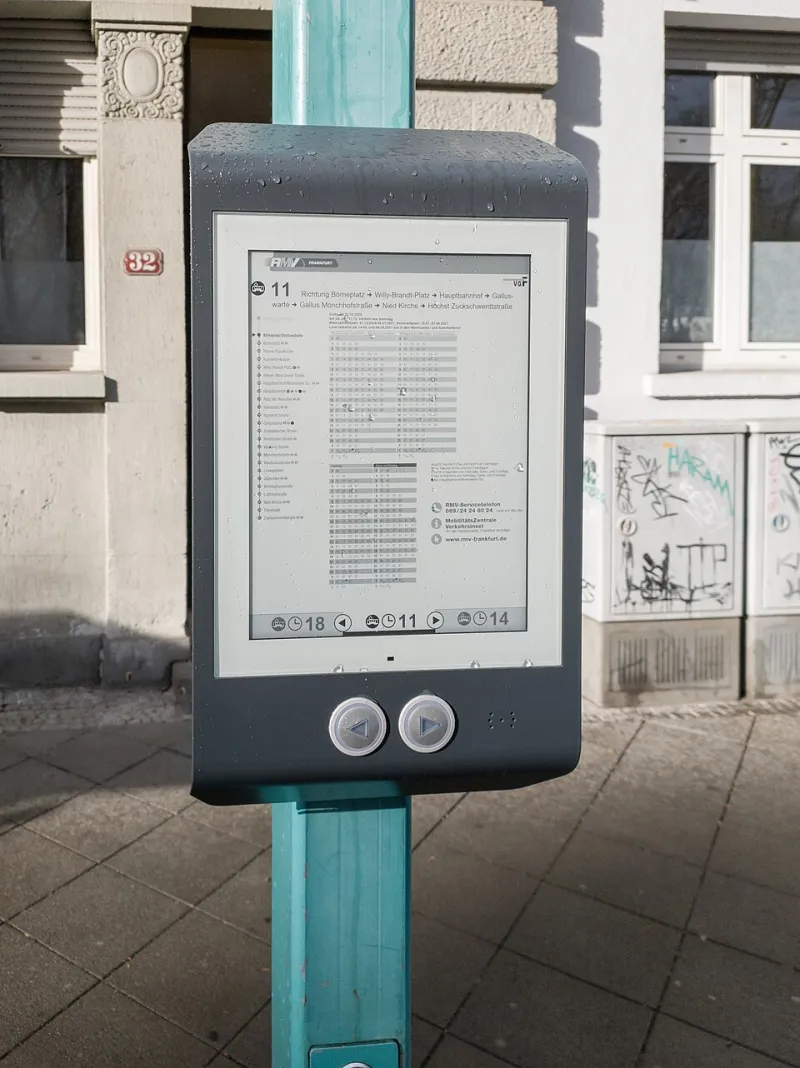
Photo: Matti Blume, CC BY-SA 4.0, via Wikimedia Commons
The e-ink display arrived with a dead row near the bottom. Not a scratch. Not a smudge. A clean horizontal line where the pixels had simply stopped participating. Most people would return it, bin it, or write a one-star review with the word unacceptable in all caps.
Finnish design would like a word. Finnish design has a long relationship with visible flaws, honest materials, and objects that do not pretend to be perfect. A dead row is not a tragedy. It is a line. You can design around a line. You can even make the line part of the layout. This is the dead pixel aesthetic, and it is more useful than it sounds.
Why a dead row is not a dealbreaker
E-ink is already an honest technology. It is slow. It ghosts. It does not glow like a phone. That is the point. It is a display that behaves like paper, and paper has flaws. A dead row is just a more obvious flaw.
The trick is to stop treating the screen as a pristine canvas. Treat it as a physical object with a quirk. If the dead row is at the bottom, give it a job. Make it a divider. Leave it as white space. Put a caption above it. The screen does not have to be perfect to be useful. It only has to answer a question.
The object we wanted
We wanted a desk dashboard that answers three questions without asking for attention: What is the weather? When is the next bus or train? What is the next calendar event? No notifications. No touch. No app. No account. Just a quiet rectangle that updates every few minutes and then goes back to being furniture.
This is the opposite of a smart home interface. It is not a control panel. It is a sign. Signs are allowed to be imperfect. A street sign with a bent corner still tells you the street name. An e-ink dashboard with a dead row still tells you to bring a jacket.
The parts
You need the display, a driver board, and a small computer. A Raspberry Pi Zero 2 W is plenty. An ESP32 works if you are comfortable with MicroPython or Arduino and do not mind a little more fiddling. You need a power supply, a frame, and something to mount it to. A picture frame from a thrift store is fine. A piece of plywood is also fine. Finnish design does not require a CNC router.
On the software side, you need Python, Pillow for rendering, and a way to fetch data. OpenWeather or the National Weather Service API for weather. A local transit API for buses or trains. A calendar feed in ICS format for events. Keep the dependencies boring. Boring dependencies survive.
The layout
Design for the dead row first. If the row is near the bottom, reserve the bottom inch for a horizontal rule and a timestamp. The dead row becomes a deliberate gap between the data and the frame. If the row is in the middle, split the dashboard into two zones and let the line be the border. If the row is at the top, put the date above it and the data below. Nobody needs to know the original layout. They only see the object.
Use large type. E-ink is readable in daylight, but small type at a distance is a mistake. Three data blocks are enough. Weather in the top left. Transit in the top right. Calendar across the bottom. Leave white space. White space is not wasted space. It is the Finnish equivalent of a comfortable silence.
The refresh strategy
E-ink does not like constant partial refreshes. It ghosts. It leaves shadows of the previous image. The solution is a schedule: partial refresh every fifteen minutes for the clock and weather, full refresh every hour or two to clear the ghosting. If the display supports it, use a full refresh overnight. The screen will flicker. That is normal. Do not panic. It is not broken. It is clearing its throat.
The dead row will not refresh, because it is dead. That is fine. It is now a permanent design element. You are not hiding it. You are acknowledging it. This is the difference between a flaw and a feature. A flaw is something you pretend not to see. A feature is something you build around.
Build steps
First, identify the dead row and measure it. Second, create a canvas in Pillow at the display's native resolution. Third, fetch the data and handle failures gracefully. If the transit API is down, show the last known arrival and a small note. If the weather API is down, show a dash. Do not show an error message in the middle of the screen. This is a dashboard, not a terminal.
Fourth, render the layout. Use a font you can read from three feet away. Fifth, push the image to the display with the manufacturer's driver. Sixth, schedule the script with cron or a systemd timer. Seventh, put it in a frame. Eighth, live with it for a week before you change the layout. Most dashboard projects fail because the builder redesigns the screen every day instead of using the thing.
Make it useful, not precious
The dashboard should not become a project museum. It should answer its three questions and then get out of the way. No animations. No stock tickers. No inspirational quote of the day. The quote is always the same quote, and it is always slightly disappointing.
A dead row is a reminder that the object is real. It is not a rendered mockup. It is a piece of glass and plastic that has been used, handled, and maybe dropped. Finnish design humility says: do not hide the material. Do not fake the wood grain. Do not put a bezel over the flaw and pretend it is a design choice. Let the thing be what it is.
The result is a desk object that feels less like a gadget and more like a very slow, very calm assistant. It does not ask for updates. It does not want your password. It does not need an app. It just sits there with a dead row and a useful sentence about the weather.
That is not a broken display. That is a display with character.